Layout Plugin
→ See setup instructions for the Layout plugin
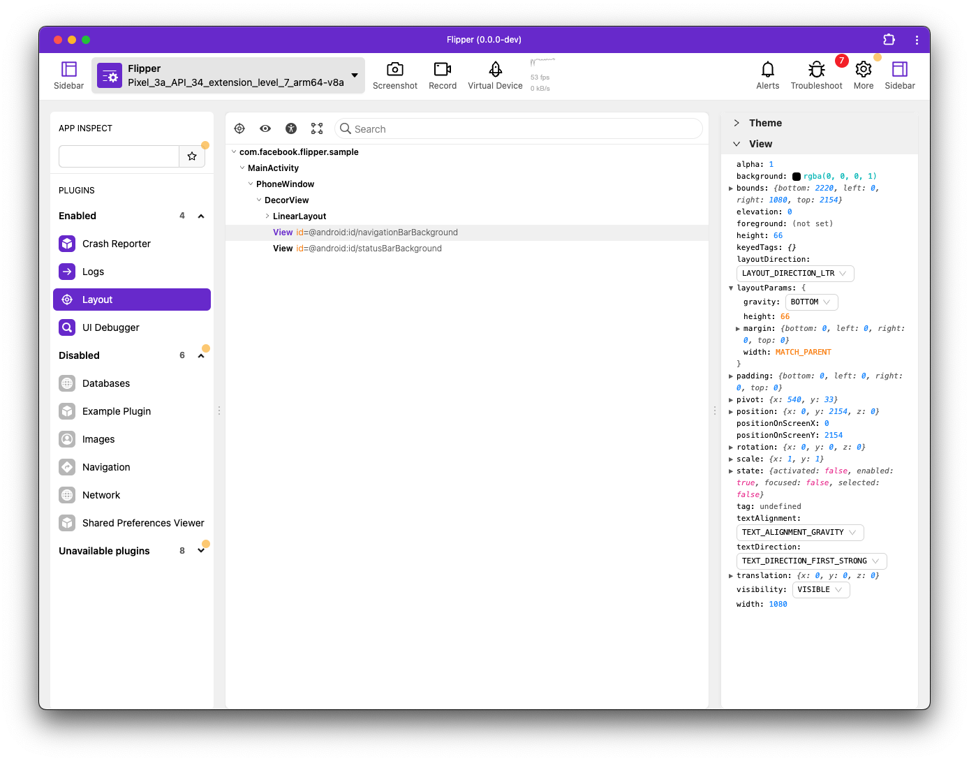
The Layout Inspector is useful for a wide variety of debugging scenarios. You can inspect what views the hierarchy is made up of as well as what properties each view has; this is incredibly useful when debugging issues with your product.
In addition to Flipper, the Layout tab supports Litho and ComponentKit components; it integrates with these frameworks to present components in the hierarchy just as if they were native views, exposing all the layout properties, props, and state of the components. The Layout Inspector is further extensible to support other UI frameworks.
If you hover over a view or component in Flipper (as show in the following screenshot), the corresponding item in your app is highlighted. This is perfect for debugging the bounds of your views and making sure you have the correct visual padding.
Quick edits
In addition to enabling you to view the hierarchy and inspect each item's properties, the Layout Inspector also enables you to edit almost everything, such as layout attributes, background colors, props, and state. This allows you to quickly tweak paddings, margins, and colors until you are happy with them, all without re-compiling. This can save you many hours implementing a new design.
Target mode
You can enable 'target mode' by clicking on the crosshairs icon (see screenshot, above). After which, you can touch any view on the device and the Layout Inspector will jump to the correct position within your layout hierarchy.
Target mode also works with Talkback running.
Accessibility mode (Android-only)
You can enable 'accessibility mode' by clicking on the accessibility icon (see screenshot, above). This shows the accessibility view hierarchy next to the normal hierarchy. In the hierarchy, the currently accessibility-focused view is highlighted in green, and any accessibility-focusable elements have a green icon next to their name. The hierarchy's context menu also allows you to focus accessibility services on certain elements. When selecting an element in one hierarchy, the corresponding element in the other will also be highlighted. The hierarchies expand and collapse in sync and searching through the main hierarchy works in accessibility mode as well.
When accessibility mode is enabled, the sidebar shows special properties that are used by accessibility services to determine their functionality. This includes items such as content-description, clickable, focusable, and long-clickable, among others.
Talkback
The accessibility mode sidebar also includes a panel with properties derived specifically to show Talkback's interpretation of a view (with logic ported over from Google's Talkback source). While generally accurate, this is not guaranteed to be accurate for all situations. It is always better to turn Talkback on for verification.