Building A Desktop Plugin - Custom UI
Displaying your data in a table might work for many use-cases. However, depending on your plugin and data, it might make sense to customize the way your data is visualized.
This part of the tutorial covers how Flipper uses React to render the plugins and provides a variety of ready-to-use UI components that can be used to build custom plugin UIs.
Replacing the table
In the following scenario, instead of just listing the mammals as image URLs (as shown in Desktop Plugin - Table page), the images are rendered inside little cards, as shown in the following screenshots.
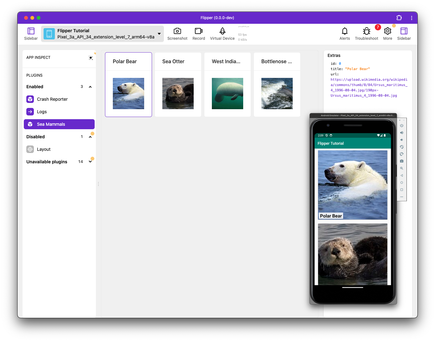
When any of the cards is selected, the relevant mammal's details are displayed in the sidebar.
Overview of the steps to create a Custom UI
The following steps provide an overview of the differences between creating a standard Table UI and a Custom UI.
- For a standard Table, the default export in
index.tsxis fromcreateTablePlugin. For a Custom UI, this is replaced with a custom React component by using the more flexible APIs exposed by theflipper-plugin. - Replace the usual
createTablePlugin(for a Table UI) with both aplugindefinition and aComponentdefinition which is used for rendering.
Separating those two concepts helps with testing and maintaining state when the user switches plugins.
Example Custom UI
The code for the example custom UI (shown below) contains numbered comments (such as '// (1)'), which are referenced in the following sections.
import React from 'react';
import {PluginClient, createState} from 'flipper-plugin';

// (3)
type Row = {
  id: number;
  title: string;
  url: string;
};

// (2)
type Events = {
  newRow: Row;
};

// (1)
export function plugin(client: PluginClient<Events, {}>) {
  // (5)
  const rows = createState<Record<string, Row>>({}, {persist: 'rows'});
  const selectedID = createState<string | null>(null, {persist: 'selection'});

  // (6)
  client.onMessage('newRow', (row) => {
    rows.update((draft) => {
      draft[row.id] = row;
    });
  });

  function setSelection(id: number) {
    selectedID.set('' + id);
  }

  // (4)
  return {
    rows,
    selectedID,
    setSelection,
  };
}

export function Component() {
  return <h1>Sea Mammals plugin</h1>;
}
The plugin declaration
Key points regarding the above Example Custom UI code:
- The implementation of the plugin is driven by the named and exported function
plugin, as defined at(1). - The
pluginmethod is called upon instantiating the plugin and receives one argument,client, that which provides all APIs needed to both interact with the Flipper desktop and the plugin loaded into the client application. - The
PluginClienttypes all available APIs and takes two generic arguments. - The first
Eventsdescribes all possible events that can be sent from the client plugin to the desktop plugin and determines the events available forclient.onMessage(see below). - In the above code, only one event can occur,
newRow, as defined at(2). However, in the real world, there are typically more events. - The data provided by this
newRowevent is described with theRowtype, as defined at(3). - The event names and data structures should correspond with the data that is sent using
connection.sendfrom the client. - The
pluginfunction has to return an object that captures the entire API you want to expose from the plugin to your UI components and unit tests. In this case, it returns the state atomsrowsandselectedID, and expose thesetSelectionmethod ((see(4))).
Writing plugin logic
Since the plugin function will execute only once during the entire lifecycle of the plugin, you can use local variables in the function body to preserve state.
In the example Custom UI, above, there are two pieces of state (see (5)):
- The set of rows available,
rows. - The current selection:
selectionID.
For larger data collections, it's strongly recommended to leverage the better optimized createDataSource. But, in this tutorial example, createState is sufficient for a small data set.
It's possible to store state directly in let declarations, but createState creates a storage container that gives you a few advantages:
- Most importantly, state created using
createStatecan be subscribed to by the UI components using theuseValuehook. - State created with
createStatecan be made part of Flipper imports / exports. This feature can be used by providing a uniquepersistkey. The current value of the container can be read using.get(), and.set()or.update()can be used to replace the current value. - The
clientcan be used to receive and send information to the client plugin.- With
client.send, you can invoke methods on the plugin. - With
client.onMessage(see(6)) you can subscribe to the specific events as specified with theEventstype (see(2)).
- With
- In the event handler, you can update some pieces of state, using the
.setmethod to replace state, or the.updatemethod to immutably update the state using Immer. - In the Example Custom UI, the received row is added to the
rowsstate under its ownid. - Finally, (see
(7)), you can create (and expose at(4)) a utility to update the selection, which is used in the Building a User Interface for the plug section, below.
No state should be stored outside the plugin definition; multiple invocations of plugin can be 'alive' if multiple connected apps are using the plugin.
Storing the state inside the closure ensures no state is mixed up.
Testing plugin logic
This section features a scenario where unit tests are always written before creating a Custom UI for a plugin.
Unit tests will be picked automatically by Jest if they are named like __tests__/*.spec.tsx, so create a file called __tests__/seamammals.spec.tsx and start the test runner by
running yarn test --watch in your plugin root.
Here is the Initial Unit Test code:
// (1)
import {TestUtils} from 'flipper-plugin';
// (2)
import * as MammalsPlugin from '..';

test('It can store rows', () => {
  // (3)
  const {instance, sendEvent} = TestUtils.startPlugin(MammalsPlugin);

  expect(instance.rows.get()).toEqual({});
  expect(instance.selectedID.get()).toBeNull();

  // (4)
  sendEvent('newRow', {
    id: 1,
    title: 'Dolphin',
    url: 'http://dolphin.png',
  });
  sendEvent('newRow', {
    id: 2,
    title: 'Turtle',
    url: 'http://turtle.png',
  });

  // (5)
  expect(instance.rows.get()).toMatchInlineSnapshot(`
    Object {
      "1": Object {
        "id": 1,
        "title": "Dolphin",
        "url": "http://dolphin.png",
      },
      "2": Object {
        "id": 2,
        "title": "Turtle",
        "url": "http://turtle.png",
      },
    }
  `);
});
The code for the Initial Unit Test (shown above) contains numbered comments (such as '// (1)'), which are referenced in the following information.
Key points regarding the Initial Unit Test code:
- Testing utilities for plugins are shipped as part of
flipper-plugin, so can be imported directly (see(1)). - You directly import the above plugin implementation into your unit test.
- By using
as, you put the entire implementation into one object, which is the format in which your utilities expect them ((2)). - Using
TestUtils.startPlugin((3)) instantiates the plugin in a fully mocked environment where the plugin can do everything except for actually rendering, which makes this operationally inexpensive. - From the
startPlugin, you get back aninstance, which corresponds to the object returned from thepluginimplementation (see(4)in the example Custom UI, above).- You also get a bunch of utilities to interact with the plugin. The full list is documented Desktop Plugin API page. However, for this test, the sole concern is with
sendEvent.
- You also get a bunch of utilities to interact with the plugin. The full list is documented Desktop Plugin API page. However, for this test, the sole concern is with
- By using
sendEvent, you can mimic the client plugin sending events to your plugin(4). Similarly, you can emulate all other possible events, such as the initial connection setup with (.connect()), the user (de)selecting the plugin (.activate()/deactivate()), or a deeplink being triggered (.triggerDeepLink), and so on. - After the events have been sent, it's expected the internal state of the plugin should have been updated; this is asserted at point
(5).- The assertions are provided by Jest. Particularly useful is
toMatchInlineSnapshot, which generates the initial snapshot during the first run of the unit tests, saving a lot of effort.
- The assertions are provided by Jest. Particularly useful is
Building a User Interface for the plugin
So far, in index.tsx, the Component hasn't yet done anything useful. This section explains how to build an effective and nice-looking UI.
Flipper leverages Ant design, so any official Ant component can be used in Flipper plugins.
The styling system used by Flipper can be found at the style guide, where the the different Layout elements are documented.
import React, {memo} from 'react';
import {Typography, Card} from 'antd';
import {
  Layout,
  PluginClient,
  usePlugin,
  createState,
  useValue,
  theme,
  styled,
  DataInspector,
  DetailSidebar
} from 'flipper-plugin';

// (1)
export function Component() {
  // (2)
  const instance = usePlugin(plugin);
  // (3)
  const rows = useValue(instance.rows);
  const selectedID = useValue(instance.selectedID);

  // (4)
  return (
    <>
      <Layout.ScrollContainer
        vertical
        style={{background: theme.backgroundWash}}>
        <Layout.Horizontal gap pad style={{flexWrap: 'wrap'}}>
          {Object.entries(rows).map(([id, row]) => (
            <MammalCard
              row={row}
              onSelect={instance.setSelection}
              selected={id === selectedID}
              key={id}
            />
          ))}
        </Layout.Horizontal>
      </Layout.ScrollContainer>
      <DetailSidebar>
        {selectedID && renderSidebar(rows[selectedID])}
      </DetailSidebar>
    </>
  );
}

function renderSidebar(row: Row) {
  return (
    <Layout.Container gap pad>
      <Typography.Title level={4}>Extras</Typography.Title>
      <DataInspector data={row} expandRoot={true} />
    </Layout.Container>
  );
}
The above User Interface code contains numbered comments (such as '// (1)') that are referenced in the following information.
Key points regarding the above User Interface code:
- A plugin module can have many components but should always export one component named
Component, which is used as the root component for the plugin rendering. The component mustn't take any props and will be mounted by Flipper when the user selects the plugin (see (1)). - Inside the component, you can grab the relevant instance of the plugin by using the
usePluginhook (see(2)). This returns the instance API returned in the Example Custom UI at the end of thepluginfunction. The originalplugindefinition is passed to theusePluginas argument: this is done to get the typings ofinstancecorrect and should always be done. - With the
useValuehook ((3)), you can grab the current value from the states created earlier usingcreateState. The benefit ofuseValue(instance.rows)overusingrows.get(), is that the first will automatically subscribe your component to any future updates to the state, causing the component to re-render when new rows arrive. - Since both
usePluginanduseValueare hooks, they usual React rules for them apply; they need to be called unconditionally. So, it's recommended to put them at the top of your component body. Both hooks can not only be used in the rootComponent, but also in any other component in your plugin component tree. So, it's not necessary to grab all the data at the root and pass it down using props. UsinguseValueas deep in the component tree as possible will benefit performance. - Finally, the data is rendered and returned (see
(4)). The details have been left out here, as from this point it's just idiomatic React code.
The source of the other MammalCard component is located in GitHub.
It's recommended to keep components outside of the entry file as much as possible because components defined outside the index.tsx file will benefit from fast refresh.
Unit testing the User Interface
You can lower the chances of regression in the UI by adding another unit test to the seamammals.spec.tsx file and asserting that the rendering is correct and interactive. The following code provides an example:
test('It can have selection and render details', async () => {
  // (1)
  const {
    instance,
    renderer,
    act,
    sendEvent,
    exportState,
  } = TestUtils.renderPlugin(MammalsPlugin);

  // (2)
  sendEvent('newRow', {
    id: 1,
    title: 'Dolphin',
    url: 'http://dolphin.png',
  });
  sendEvent('newRow', {
    id: 2,
    title: 'Turtle',
    url: 'http://turtle.png',
  });

  // (3) Dolphin card should now be visible
  expect(await renderer.findByTestId('Dolphin')).not.toBeNull();
  // (4) Let's assert the structure of the Turtle card as well
  expect(await renderer.findByTestId('Turtle')).toMatchInlineSnapshot(`
    <div
      class="css-ok7d66-View-FlexBox-FlexColumn"
      data-testid="Turtle"
    >
      <div
        class="css-vgz97s"
        style="background-image: url(http://turtle.png);"
      />
      <span
        class="css-8j2gzl-Text"
      >
        Turtle
      </span>
    </div>
  `);

  // (5) Nothing selected, so we should not have a sidebar
  expect(renderer.queryAllByText('Extras').length).toBe(0);

  act(() => {
    instance.setSelection(2);
  });

  // Sidebar should be visible now
  expect(await renderer.findByText('Extras')).not.toBeNull();

  // (6) Verify export
  expect(exportState()).toEqual({
    rows: {
      '1': {
        id: 1,
        title: 'Dolphin',
        url: 'http://dolphin.png',
      },
      '2': {
        id: 2,
        title: 'Turtle',
        url: 'http://turtle.png',
      },
    },
    selection: '2',
  });
});
The above User Interface Unit Test code contains numbered comments (such as '// (1)') that are referenced in the following information.
As in the Initial Unit Test, you can use TestUtils to start your plugin. But rather than using startPlugin, you now use renderPlugin, which has the same functionality but also renders the component in memory, using the React Testing Library, this enables you to interact with DOM.
Key points regarding the above User Interface Unit Test code:
- You start the UI test by sending some events to the plugin (
see (2)). After which (see(3)), the new data should be reflected in the DOM. - Since you used
<Card data-testid={row.title}in the component implementation (not shown above), you can search in the DOM based on that test-id to find the correct element. It is also possible to search for other entities, such as a specific classname. The available queries are documented in the React Testing Library. - Rather than just checking that the rendering isn't
null, you can also take a snapshot of the DOM and assert that it doesn't change accidentally in the future. Jest'stoMatchInlineSnapshot(see(4)) is quite useful for that. However, don't overuse it as large snapshots are pretty useless and just create a maintenance burden without catching much. - At point
(5), the code simulates updating the selection from code and asserts that the sidebar has become visible. Note that the update is wrapped inact, which is recommended as it makes sure that updates are flushed to the DOM before you make queries and assertions on the DOM (the earliersendEventdoes applyactautomatically and doesn't need wrapping)- Alternatively, you could have emulated actually clicking a DOM element, by using
fireEvent.click(renderer.findByTestId('dolphin'))(for details, see Firing Events in the docs of the React Testing Library)
- Alternatively, you could have emulated actually clicking a DOM element, by using
- Finally (see
(6)), the test grabs the final state of the plugin state by using theexportStateutility. It returns all the persistable state of the plugin, based on thepersistkeys that were passed tocreateStatein the Example Custom UI code. - You now assert that the plugin ends up in the desired state.