Building a Desktop Plugin - Showing a Table
Building a Table
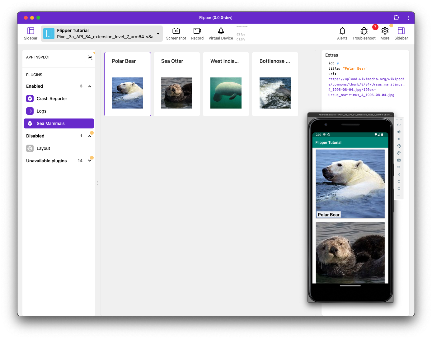
One of the best ways to understand how your app works is to get access to its underlying data, which are used to display items on screen. An efficient way of achieving this is by showing the data in a table. The data for Sea-mammals has been optimized for easy display in a table, which you can sort, filter and select items for more detailed information.
In this section of the tutorial, you'll be editing the index.tsx file that was generated in the previous scaffolding step.
Row Types
Start off by defining what your table rows look like:
type Row = {
  id: number,
  title: string,
  url: string,
};
It's important that you have some unique identifier for every row so that you know when something new was added to the table; the 'id' field is sufficient
Columns
Define which columns to show and how to display them:
import {DataTableColumn} from 'flipper-plugin';

const columns: DataTableColumn<Row>[] = [
  {
    key: 'title',
    width: 150,
  },
  {
    key: 'url',
    title: 'URL',
  },
];
The keys used here will show up again in the next step when building your rows, so keep them consistent.
The title defined for each column will show up as the header at the top of the table and will be default to the key value if omitted.
For the width, you can either choose a fixed number (pixels), a percentage, or leave it out to distribute the remaining available space.
Configuring the table
You now have a Row type that describes the data you'll be storing and a description of the columns to display. With these components it's a trivial task to get a table showing data, including search / sort and a details view, as shown in the following code snippet:
import {DataTableColumn, createTablePlugin} from 'flipper-plugin';

const {plugin, Component} = createTablePlugin<Row>({
  columns,
  method: 'newRow',
  key: 'id',
});
export {plugin, Component};
The above code snippet has the following properties:
method- refers to the method that should be listened to to fill the table with data.'newRow'- refers back to the identifier used withconnection.sendto send the data to the Flipper desktop application in the previous step.key- [optional] - but by setting this property, the'id'field is used as an identifier. As a result, once anewRowmessage arrives with an existingid, it will overwrite the old entry, rather than appending a new one.
The createTablePlugin API supports more options, which are documented in the Dektop Plugin API page.
And that's all there is to it!
Starting Flipper will now compile your plugin and connect to the native side. It's a good idea to start Flipper from the command line to see any potential errors. The console in the DevTools is a great source of information if something doesn't work as expected, too.
The final result of this step can be seen at index_table.tsx.
What next?
You now have an interactive table that you can sort, filter and use to get additional information about the data you see on screen.
The createTablePlugin is a high-level abstraction that takes care of both connection management and a standardized UI for the most common scenario.
For many cases, this is all you need. However, sometimes you may want to build something a bit more custom, which is covered in the Desktop Plugin - Custom UI page